
 Tiếng Việt
 日本語
日本語dịch vụ thiết kế website ,Tin tức
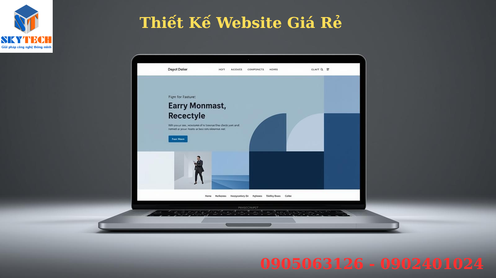
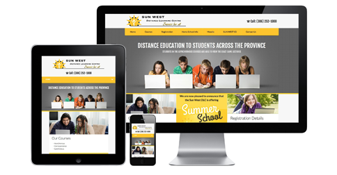
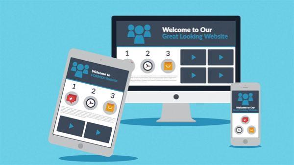
Web design according to Mobile standards – responsive website

Today, the phrase of web design according to mobile standards, responsive website … surely is no stranger to people working in the field of e-commerce. By now, users have the habit of using a smartphone or tablet to access the internet or perform product searches, photos, prices … anytime anywhere by its convenience. Therefore, it is extremely important to make sure your website displays correctly and fits on every handset.
What is mobile web design?
Mobile web design (mobile-friendly web design) is a specialized website designed to run on mobile phones and tablets thanks to Responsive Design technology. Thanks to this Responsive design technology, your website automatically scales to the screen resolution to provide the best experience for users.
You are wondering whether your website has been designed for mobile optimization or not, you can check it through Google’s check tool.
A website commonly found on computers is different from the one you see on mobile devices. Even in some websites, each type of tablet screen, phone with different screen sizes, the websites will display differently. Therefore, the concept of web design according to mobile standards was born to serve the website running well on all search devices.
Benefits of designing websites according to Mobile standards
+ Browsing speed is higher than a PC website running on mobile. Because all the details on the website are minimalist to fit the small size of moblie.
+ Website operates more stably, is accessed easily and operates effectively.
+ Friendly to website visitors, helping people find information and feedback easier.
+ Search and move websites on Mobile quickly and easily. Easy to operate on the screen with multi-touch gestures – swipe – swipe on the screen
+ Ordering and payment online is very simple.
+ Remove annoying ads: Banner ads or unnecessary parts will be removed when viewing the web browser on mobile devices, this will help the website load faster as well as create comfort for people. use.
+ Optimize SEO on mobile: Now you do not need to worry about your website rankings on mobile devices anymore, because your website has been optimized with mobile SEO, this SEO website also becomes simple and easier
+ Improve the competitiveness with other businesses: Making mobile websites will surely attract the attention of customers to your website. Since then improve the competitiveness with competitors in the same business field.
SKYTECH TECHNOLOGY DEVELOPMENT CO. LTD
Address: Lot 43, P3.10, Hoa Binh 4 Street, Hoa Quy Ward, Ngu Hanh Son Dist. Danang
Representative office: 320 Street 2/9, P. Hòa Cường Bắc, Q. Hải Châu, TP. Danang
Phone: 0941.300.639 – 0902.401.024.
Email: sales@skytechkey.com
Facebook: https://www.facebook.com/SkyTechKey.Web.PhanMem.Camera.BenReDep/
Instagram: https://www.instagram.com/skytechkey/
Twitter: https://twitter.com/SkyTechDaNang
See more : dịch vụ thiết kế website ,Tin tức
Contact now Skytech today for the best deals..
Related posts: